The problem with climate communication isn’t the bad graphs. It’s all of them. Graphs are harder than we give them credit for.
I want to start with Minard.
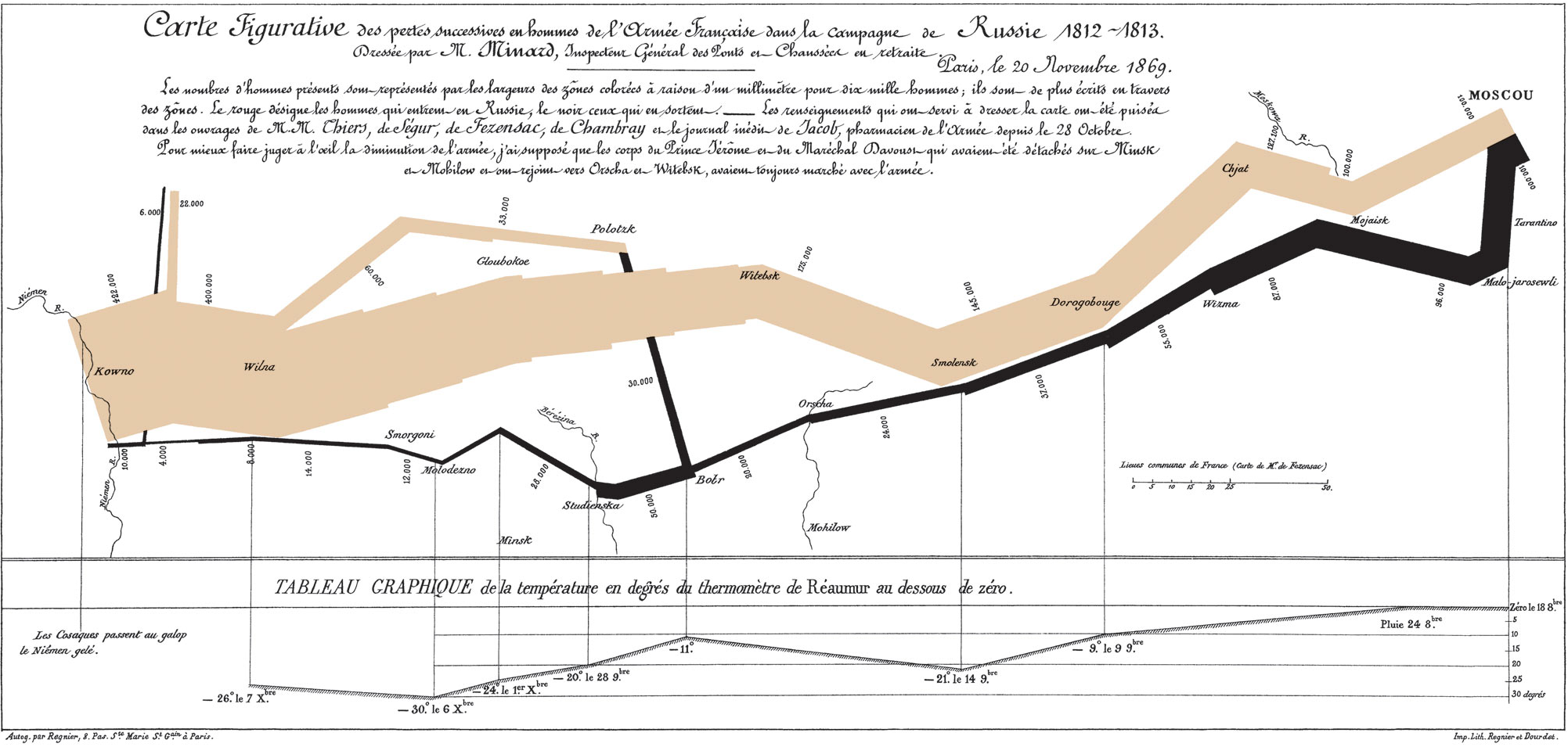
Charles Joseph Minard made this at 88 after fifty-some years of turning data into magical art. It shows Napoleon’s march into Russia and the catastrophic retreat. The band starts wide (422,000 men) and shrinks as you follow it. By the end, 10,000. The temperature chart below shows -30°C at the Berezina crossing.
Six variables in two dimensions. It’s considered the best statistical graphic ever made.
I went to grad school for graphs, kind of. Econometrics, social science, formal data visualization education. We learned the rules like med students learn anatomy.
Bar charts over pie charts because Cleveland’s 1984 research proved humans perceive length more accurately than angle. Tufte’s “chartjunk” and “data-ink ratio.” Every drop of ink should convey information.
I like following a methodology and having a well-cited tool kit for how I work. I spent years perfecting templates so my teams could get the charts right.
When I was an evaluator, I’d make 100-page reports for utilities, and be required to include 40 pages of pie charts. And mostly? Nobody cared. The feedback was always “can you add even more pie charts” or “make the title bigger.” All that training was invisible to the people I was serving.
So here we are with decades of temperature graphs. Beautiful, accurate, unambiguous. The visualizations are correct. The data is clear.
And people still don’t get it.
We do it to ourselves, too.
There’s a graph that climate advocates share constantly showing billion-dollar disasters increasing over time. The line goes up and to the right. It looks devastating. It is devastating, in a way.
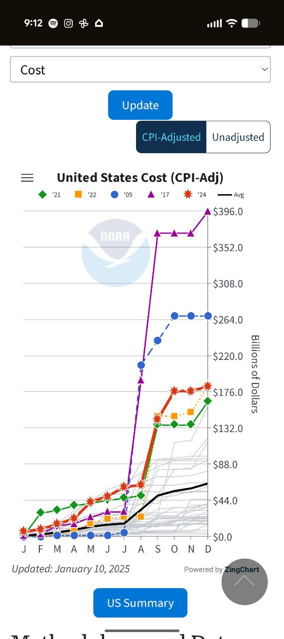
But most people who share it can’t explain why the line goes up. Is it because disasters are getting worse? Climate change is making some types of disasters more frequent and intense – that’s real and significant. But this graph only adjusts for inflation. It doesn’t adjust for population growth in disaster-prone areas, or the fact that there’s vastly more expensive infrastructure in the path of hurricanes than there was in 1980. When researchers control for those factors, the economic trend looks very different. The climate impact is real. This particular graph just isn’t the best way to show it.
The data is solid, but every graph involves presentation choices that affect whether people understand it correctly. Where does the y-axis start? What’s the first year shown? How much smoothing goes into the trend line? These choices don’t change what the data says, but they absolutely change whether your audience gets the message. A good visualization can make valid data sing. A careless one can make the same data confusing or misleading, even when nothing is technically wrong.
We’ve all done this. Shared something because it looked right, not because we understood it. Psychologists call this the “illusion of explanatory depth”: we think we understand things until someone asks us to actually explain them (Rozenblit & Keil, 2002). Understanding takes time, and time is scarce. I’m not solving that problem here.
And I wonder if we’re losing our audience partly because we never really had the message ourselves.
The other side does it too, of course. Recently a graph went viral claiming “no net warming in 28 years.” It used satellite data starting in 1998, drew a flat trend line, and asked: if emissions cause warming, how is this possible? 1.8 million views.
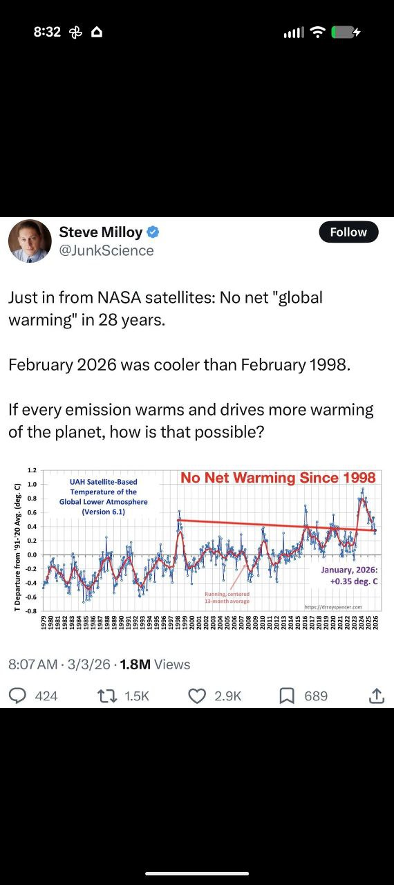
What the graph doesn’t tell you: 1998 was a massive El Niño year, one of the hottest outliers in the record. Start there and everything after looks flat. Start five years earlier or later, the trend is obvious. The data source (UAH satellite measurements) runs cooler than surface records and has known calibration issues. And if you actually look at the graph, even with the cherry-picked start date, the line still trends upward. The “flat” trend line was just drawn that way.
Most people who shared it couldn’t explain any of that. They saw a graph that confirmed what they wanted to believe, and they hit retweet. Same cognitive shortcut (of course, none of this applies if there’s intentional misrepresentation). But both get shared by people who can’t explain them, and that’s the problem this essay is about.
The thing that actually made me think about this was a checkbox requirement.
WCAG 2.2, the web accessibility guidelines, requires text alternatives for complex images. Charts need alt text. You have to explain your visuals in words, for screen readers, for people who can’t see the image.
When I started writing alt text seriously, I realized how many charts I didn’t need to be making.
Because alt text forces the question: what is this visualization actually adding? What would someone miss if they only had the words?
A lot of the time, the answer was nothing. The chart was decoration. It was there because reports have charts, not because this particular chart was doing work that words couldn’t.
I had this experience recently with a legislative report for Washington State’s Building Performance Standards. Huge document, full of graphs. I was adding alt text for WCAG compliance, and halfway through, I realized: I don’t need these. The words are doing the work. So I cut the charts. The doc got cleaner, shorter, easier to read. Non-technical stakeholders could follow the argument without hitting walls of data visualization. The alt text requirement forced me to ask whether each graph was doing real work, and most of them weren’t.
But more than that, writing alt text forced me to understand what I was sharing. If I couldn’t explain the graph in a sentence, maybe I didn’t understand it well enough to be sharing it at all.
I learned math as an adult.
I didn’t get it as a kid. I was the student who checked out when the numbers appeared on the board. Every chart was a potential exit ramp, a signal that this content wasn’t for me.
I know what it feels like to see a graph and immediately tune out. To assume I’m not the intended audience. To wonder if my confusion is my fault or if the person presenting just didn’t bother to explain.
So when I think about sharing climate visualizations, I think about the people who might look at a beautiful, accurate graph and feel like I used to feel: locked out.
Every chart we share without context is a potential exit ramp for someone who’s anxious about numbers. And there are a lot of those people. If we want to communicate, we have to meet them where they are.
The Test
Before I share any graph now, I ask myself five questions:
- Why is this graph here? What is it trying to convey? What information is it actually presenting?
- What am I leaving to assumption? Color choices, acronyms, axis labels. What requires insider knowledge to interpret correctly?
- What do skimmers miss? If someone skips the graph entirely and just reads the text, do they still get the point?
- What do graph-only readers get wrong? If someone only looks at the visual and skips everything I wrote, will they misunderstand?
- What is this graph NOT showing? (Omissions, normalization choices, time frame selection, what would change the story if included.)
Both audiences have to land in the right place: the people who skip the graph AND the people who skip the text. If either group walks away confused or misinformed, the visualization isn’t working.
If you can’t write the alt text, you don’t get to click share.
I’m not going to become a TikTok creator. That’s not a failure. That’s self-knowledge.
I hope climate photographers keep taking photographs without needing to explain them. I hope painters paint. I hope TikTokers keep TikTok-ing. I hope lots of people on this planet get involved in climate communication, in whatever medium they’ve figured out, explaining their reasons, their impacts, and what they’re going to do to get the outcomes they want. Not everyone needs to understand math to want a world that feels different from this one.
Writing works for me. Thinking about things conceptually, turning them over, finding the angle: that makes me happy. I keep thinking about it after I’ve written it. That’s how I know it’s mine.
Minard didn’t make the best graph ever by adapting to someone else’s medium. He made it by mastering his own. He was 88. He’d been doing this his whole life. And when he sat down to show Napoleon’s catastrophe, he had all the tools he needed.
I think we need to understand graphs before we share them.
Not because the graphs are bad. Because if we can’t explain what they mean, in plain words, to someone who isn’t already convinced, then we’re not communicating. We’re just posting.
Climate communication isn’t about finding the perfect visualization. It’s about understanding what you’re trying to say, and then saying it in whatever medium you’ve actually mastered.
For me, that’s writing. For someone else, it might be video, or community organizing, or teaching, or making art. The medium matters less than the mastery. And the mastery matters less than actually understanding the thing you’re trying to share.
If you can’t write the alt text, you don’t understand it yet.
If you can’t write the alt text, you haven’t done the work yet. Do the work.
Anna Kelly writes about climate, communication, and the things she’s still figuring out. She’s the author of Climate Champions and was the 2023 AEE Young Energy Professional of the Year.